# Female Participation over Time
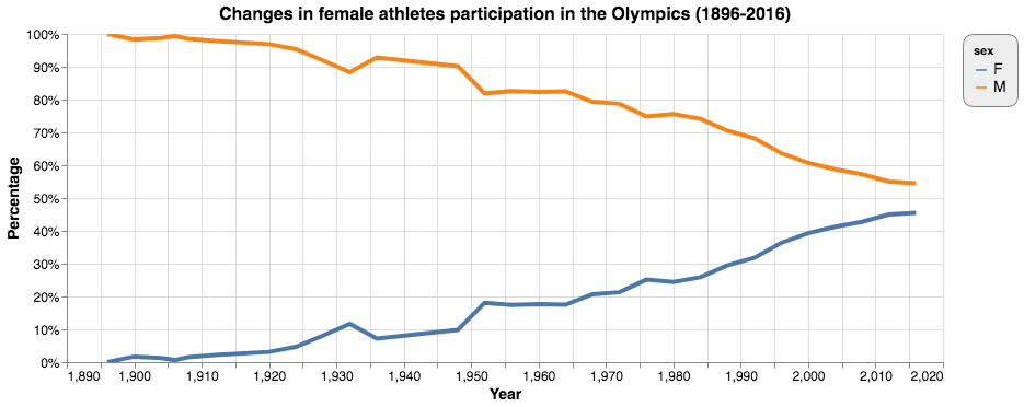
As planned above, we started with a simple line graph displaying both male and female athletes’ percentage against all athletes. The strength of this method is that it is simple and clear. It shows that the female percentage has been steadily growing in the past century at the Olympics. The drawback is that it does not generate a stark contrast between male and female as a stacked bar chart can do. See Figure 21.

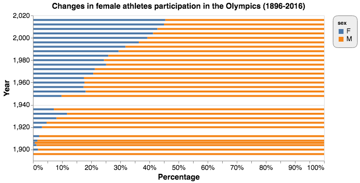
We then used stacked bar graphs. We first tried stacking the bar horizontally with percentage on the x-axis and time on y-axis. See Figure 22.

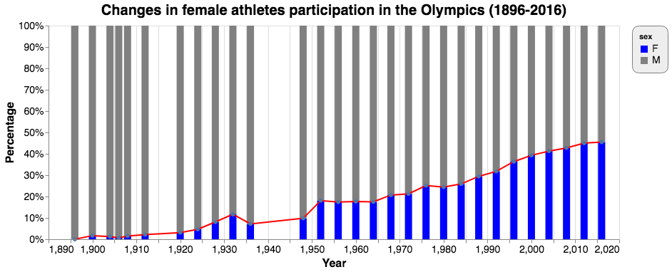
It was not as beautiful as we wanted, so we tried to put it upright and replace the axis labels. To highlight the trend, we set the male section grey and the female part bright blue. We also drew a red line at the intersection of the two parts. This time, female participation was obviously highlighted and the trend shown very clearly. See Figure 23.

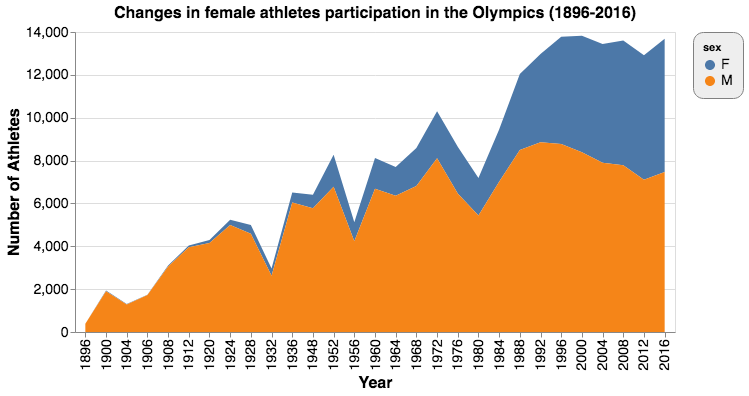
However, as discussed above, stacked bar charts can only show the changes in percentages, not those in the actual number of participants. To also visualize how the total number of athletes participating in the Olympics changed over the century, we opted for a stacked area chart. See Figure 24.

The x-axis denotes time and the y-axis number of athletes. Areas are made up of male and female participants. The two added up to the total number of athletes. This stacked area chart not only shows the changes in female participation, it also displays how the total number of athletes has been increasing over the years. The drawback is that area is not a much preferred visual encoding. As a result, the comparison of percentages of male and female is not very accurate. That said, we think its strengths outweigh its disadvantages.
